OO version: 3.3
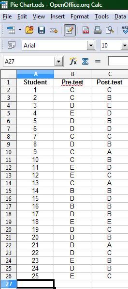
I have just completed my student teaching. One of my remaining tasks is to create graphic aid to demonstrate the level of learning achieved by my students. I would like to do that with a pair of "Before and After" pie charts comparing pre-unit and post-unit grades. I know how to create the basic spreadsheet, but when I try to "Insert Chart" I get a pie with 25 little wedges. What I would ultimately like is for the slices to approximate the percentage of students who fall into each category. That "Exploded Donut" style looks interesting also. This is the spreadsheet I am working from: