First of all, sorry for the current topic. I'm sure it's a pretty stupid question that calls for a basic answer, but I've been struggling with this issue for a bit and I can't find the answer myself, so I figured I would just ask the great internets for their wisdom.
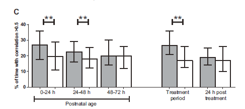
I would like to do a graph such as the one directly below using my spreadsheet data.

OpenOffice help hints that it is possible but I can't find the right graph type nor how to input the data I want to use. The windows, buttons and options I've got in OpenOffice aren't actually the same as what is told in the help.
I suppose the significance marks are to be added afterwards, as a separate drawing, but it's mainly the standard deviation lines and limits I'm worried about.
Any help please? Thanks in advance.